Another Google update is coming, and it’s going to be a big ‘un.
“Mobile,” “mobile responsiveness,” and “Mobile SEO,” are terms that have been casually thrown around in conversations and at dinner parties. Until now.
It’s getting real around here.
The latest Google update slated to hit on April 21, 2015 is termed “Mobilegeddon” because Google is warning it will have significant impact on rankings.
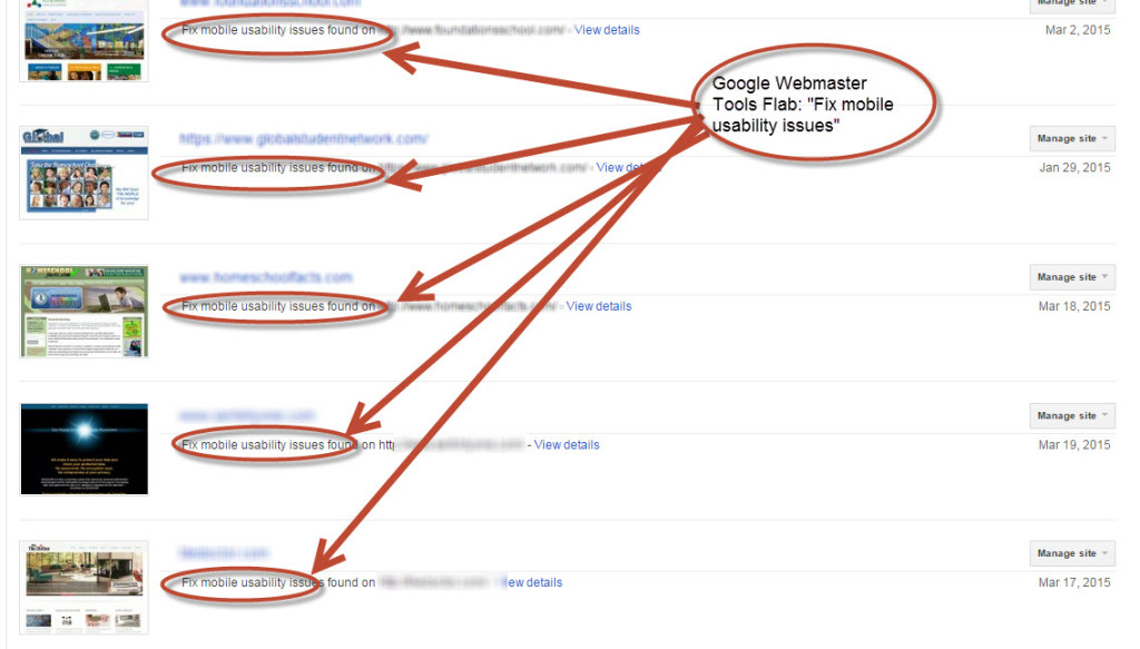
A few weeks ago Google started flagging accounts within Google Webmaster Tools (GWT) and sending warnings to webmasters to “Fix mobile usability issues.” Within GWT it looks something like this:
Here are a few of the issues I’m seeing Google flag on my clients’ websites:
- Optimize your entire site for mobile
- Don’t make users pinch-to-zoom
- Eliminating unnecessary downloads
- Small font size
- Touch elements too close
- Viewport not configured/content not sized to viewport
- Flash usage
This is a bit overwhelming, so I’ve listed out the 5 things you need to know and do now:
- Here is the core of what you need to know: “On April 21, 2015, Google’s mobile ranking factors will not only label your site as mobile-friendly, but will also use that to determine if your site should rank higher in the search results.” Here is a really good article on the basics of this update.
- If a website redesign to a mobile responsive theme is not in the budget right now, then you just have to let this all go and wait it out until the next website iteration. I know for many of my marketers and small businesses, they have no plans to redesign until next year. It’s just not in the budget. If this is your case then I feel your pain, but there is no use in worrying if you can’t do anything about it.
- If a redesign IS on your horizon, make sure to find a web designer who knows what they are doing and is very savvy with mobile. And for your own knowledge, here is a handy guide about what Google wants to see in terms of being deemed mobile friendly: https://developers.google.com/web/fundamentals/
- You are either mobile friendly or not. It is a “yes” or “no” answer. Here is what Google had to say about it: “There are no degrees of mobile-friendliness in this algorithm. It is based on the criteria we mentioned earlier, which are small font sizes, your tap targets/links to your buttons are too close together, readable content and your viewport. So if you have all of those and your site is mobile friendly then you benefit from the ranking change. But as we mentioned earlier, there are over 200 different factors that determine ranking…It depends on all the other attributes of your site, whether it is providing a great user experience or not.”
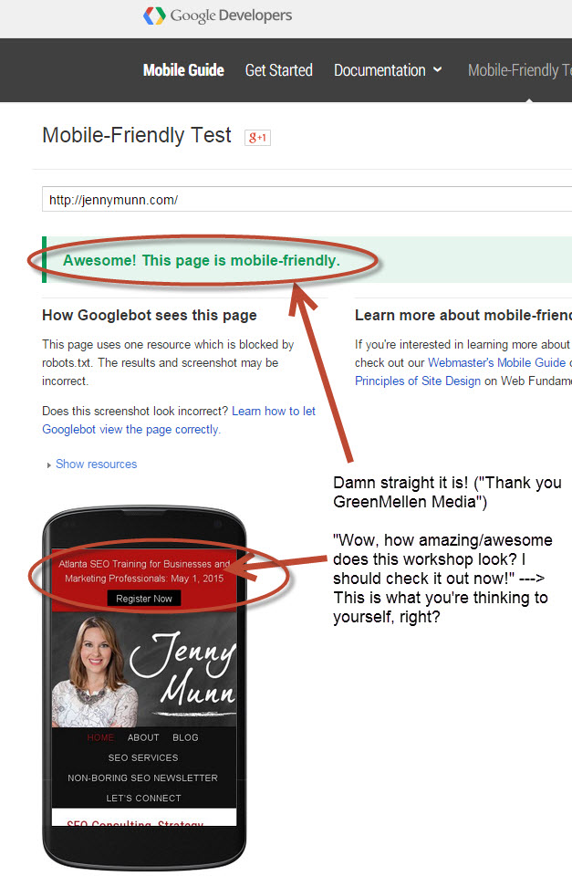
- Lastly – test your site’s URL here to see without a doubt whether you are mobile friendly or not with Google’s Mobile Testing Tool: https://www.google.com/webmasters/tools/mobile-friendly/. Here is what mine looks like:
Good luck to you! Any technical questions, turn to your nearest friendly web designer who can help.

ChatGPT for SEO Content:
Get this free resource - ChatGPT for SEO Content Cheat Sheet and learn how to maximize output and not get penalized in the process.

Jenny Munn
Latest posts by Jenny Munn (see all)
- Four 2024 SEO Planning Tips for World Domination - November 16, 2023
- SEO Planning Tip: Why You Need a CYA Clause - November 3, 2023
- How Long Does SEO Take to Show Results? (Updated for 2023) - August 9, 2023